Provider Network Analysis diagrams can be very confusing if many relationships are shown at once. To make major parts of the network more clear, simpler versions of the diagrams can be shown. By increasing the number of interactions required to show a relationship, the number of qualifying relationships will be reduced. This produces diagrams that show fewer connections.
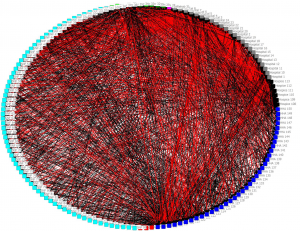
Here is an example of a very complex diagram that conveys little information:
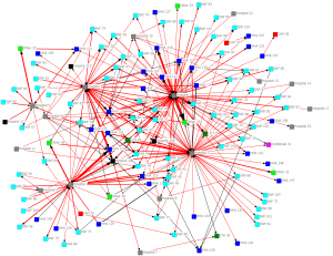
In the next diagram we only show connections with 10 or more interactions:
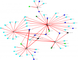
In the next diagram we only show connections with 30 or more interactions:
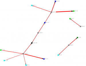
In the next diagram we only show connections with 100 or more interactions: